
What is this all about?
You need stars? Or you are actually a star? – Keep on reading! I have the right Extension for you. 😉 If you are into data you sure have strumbled across the currently available Data Studio extensions that provide stars and you might also have struggled with their limitations.
This Extension enables you to easily create and style Star-Ratings in any Range you might imagine. Need more than 5 stars? We got you covered. Want a border around the stars? Sure – why not! Remove Labels / Metrics? Heck, just one click away. 😉
To install this extension (for now – I am actually planning on submitting this to Google Data Studio Community Vis Gallery) you just have to follow the Guide below. You can also check out my slide-deck on what you can actually do with this extension below:
You can also get to this report directly by visiting the Data Studio Sample Report where the Star Rating is shown in action.
Getting the extension
To get started simply log into your Data Studio Dashboard of choice and go to the Community Viz page.
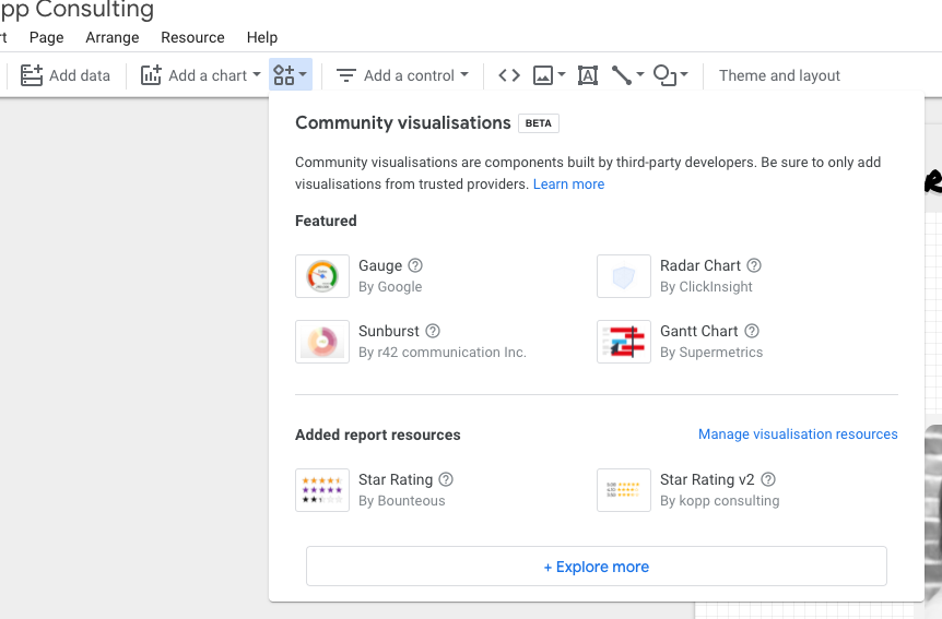
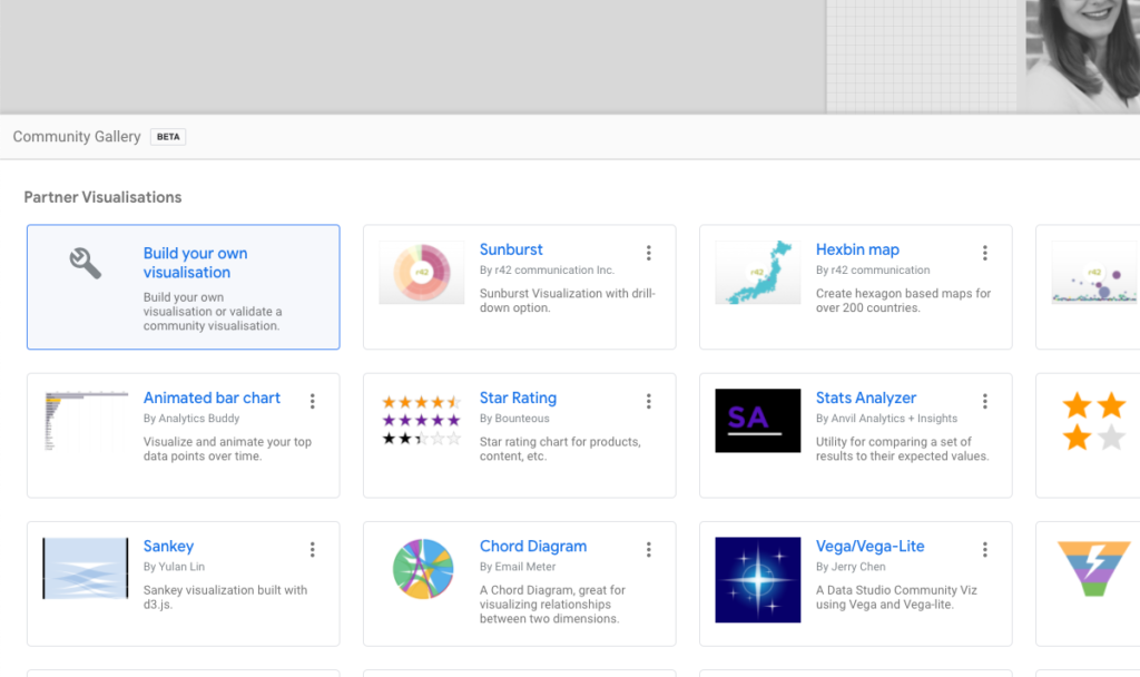
Here you can click on “Explore more” and there you will find an option that shows a wrench and says somethin alike of “Build your own visualization”.
If you are worried by now – don’t be! You do not have to build the visualization by yourself. I did the heavy lifting for you. Just copy and paste the following URL into the field “Manifeset Path” and click on Submit and afterwards on the tile that loads. Boom. Done. Nothing else needed.
gs://star-rating-v2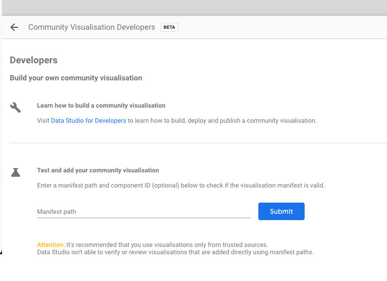
Wasn’t that much work, was it? Have fun visualising your Data!
Tech Savvy? Want to know, what’s under the hood?
You can view the entire code on Github and rebuild it on your local machine. Feel free to contribute!
PS: I also applied to have this Star Rating Visualization added to Google Data Studios Community Visualization Gallery – so fingers crossed?? Google likes it 😉