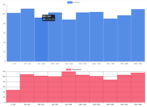
I want to take the opportunity to give you a little heads-up on a new visualization I am currently building. A beautiful (okay – at least in my opinion) Histogram.
Of course I will let you know when it is ready to be released into the wild – there are still some minor issues to be fixed. As you may have seen in my previous visualization (the one with the stars) I love packing in every feature I can possibly think of that might be handy in the future.
What is this Visualization built on?
This Visualization does runs with chart.js – in my opinion one of the best (open source) libraries for generating charts. Why you might ask? Well – let me give you the reasons why I leaned towards it:
- right from the bat it is nicely designed and gives you a great starting point
- customisability is tremendous – you can think of it, you can customise it
- it comes with animations for loading in and is almost fully scriptable
- a somewhat large and active community is working on it (I mean just look at the repo with related projects)
Of course one might argue that d3.js would have worked equally fine but would might have required a bit more styling to look beautiful-ish.
What features will (most likely) be included?
You can expect almost full cusomisability. This means:
- Fonts
- Colors
- Grids
- Setting of minima and maxima (and corresponding “catchall” groups for values above or below the boundaries)
- Setting of decimal precision (for people working with really small numbers)
- and much more
Probably you will also get the option to select between a barchart based and a stepped linechart based approach purely depending on your preference.
If there is anything that you are missing, just hit me up on linkedin and we may find a way :).